GRAPHICS
Originally published in Piedmont Computer Guild News, Fall 1998
| Most people choose a color in a computer design by picking the
shade they like from a swatch. This gives choices like "forest
green," "dark blue," or "orange." To get an accurate reproduction
of those colors, you have to understand the technology of how
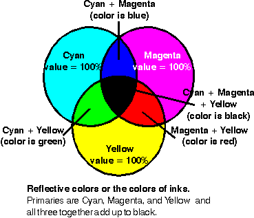
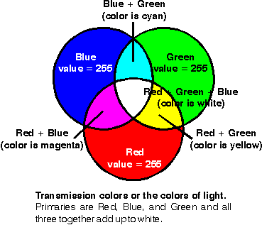
color is rendered by the medium you are using. A complete color range can be created by combining appropriate proportions of primary colors. For example, the computer may identify a particular orange as 255 Red, 125 Green, 33 Blue. (These primaries are the red, green, and blue used by a monitor or television.) The numbers represent the intensity of the illumination from black (0) to full color (255). Mixing full intensity of all three colors gives white. Unfortunately, when you're dealing with inks while the theory is similar, the details are different. The primaries are cyan (approximately Carolina a blue that Microsoft Word calls "turquoise"), magenta (a light purple that Word calls "pink"), and yellow. Full intensity of all ink colors (described as 100%) adds up to black. There is a correlation between the primaries of light or
transmission primaries and those of inks, called reflective
primaries. As shown in the illustrations below, combining two colors of
one flavor creates one of the other. Laying a full intensity of cyan
and magenta inks together results in blue. Similarly, cyan and
yellow is green while magenta and yellow is red. On a monitor;
red plus green make yellow, blue and green is cyan, and red and
blue is magenta. | [You can demonstrate this for yourself if you have a program
that allows you to enter the numeric value of a color. This
consists of a six-digit hexadecimal number like 33cc33 in
which the pairs of digits represent red, green, and blue,
respectively. If you use Microsoft Word 97 you can type each
color in the selector and then SAVE AS file type HTML. Then
choose VIEW | HTML source. You will see code like <FONT
COLOR="#ff00ff"> for the color Word calls "pink" and the
printing industry calls magenta. This means it is creating the
color from an intensity of 256 (out of 256 levels) each of red
and blue. To create a new color, while looking at the source,
change the digits to any value from 0 to 9 or a to f and exit
HTML source.] Although you can make the color from mixing primaries in appropriate proportions like 51% magenta and 87% yellow, inks for a printing press also come in pure colors so you can print
an orange or green as a single color. Of course, there are dozens
of oranges and scores more greens, reds, and blues so you have
to have a chart to choose exactly the shade you want. By the
industry standard for choosing inks, the orange we talked about
above is called Pantone® Orange 021. |
|
|
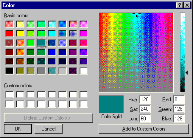
| Typically, desktop designers choose a color from a pallette of
selections offered by the program they're using. Most programs
have a choice of 16 or so colors which may, or may not, match
the colors of a 16-color VGA display. If you are not satisfied with
the selection, you can often create your own color from a rainbow
selector. Almost certainly, the colors were chosen without any
concerns toward the technology of reproducing them.
[To see how this method of color selection works, go to your
Windows display properties (right-click the desktop and
choose PROPERTIES | APPEARANCE). Click the button
labeled "color" and then choose "other." Here you see about
48 little squares of "Basic colors" and a selector where you
can choose custom colors.] | If you create a drawing using colors selected from a pallette, it may
look good on your screen; but what do you want to do with that
drawing? If the program records the colors in RGB format they
should display accurately in any program that uses the same
format. This should be adequate for an on-screen presentation as
long as the monitor or projector are similarly calibrated. If you're
using your drawing as part of a web page, the results may be
influenced by how the browser interprets the color information.
Some pages look significantly different when viewed with MSIE
than Netscape. Color printers, on the other hand, use cyan, magenta, yellow, and black inks. (Although, in theory all colors can be created with the three primaries, black is added to the calculation because piling large amounts of ink on top of each other gives muddy results. It's also less expensive to use a single ink instead of three.) When presented with an RGB picture, the printer driver converts it to the appropriate proportions of CMYK inks. Now, the accuracy of your colors are dependent on the specific inks, how the printer meters them onto the paper, the paper you're using, and even considerations such as humidity and temperature. Some programs directed at professional users may allow you to choose the exact ink colors that printers use. They are be identified by the color number issued by the company that enforces the standards. The primary standard is Pantone and their major competition is Tru-Match. Telling your printer to use these colors is like selecting a crayon out of the box, the shade is pure and consistent. If you have chosen colors this way and send the document to a desktop printer, it will convert the color into some combination of its primaries, just as it did with all the shades in your vacation photos. We've touched a little on how color is created on the screen and on paper. Next time we will see some specific tips on how to get the best results from your computer and your commercial printer. |
© 1998 Bill Barnes.
Bill Barnes is a freelance small business system administrator. Bill@pc3.org
Index of articles | Index of Graphics articles
Top of Page | Home | Contact | Disclaimers
All material (c) Bill Barnes unless otherwise attributed
Last updated Sunday, September 05, 2004 01:39 PM