Originally published in Piedmont Technology Guild News, 2nd Quarter 1999
| Most people want one of two things when they think about color: 1)
Something that is easy to use and pleasant to look at. 2) Color that is
accurate. If you fall in the former category, you create color by selecting from a
16- or 256- color palette In many situations, acceptable is not sufficient. Corporations spend big
bucks honing their image and get upset if you describe their logo as
“blue.” Similarly, a catalog shopper needs to know if a sweater will
match her outfit before ordering it. Accuracy can only be achieved if all
systems are calibrated to standards from creation through presentation.
| “Real” ColorLast time we talked about rendering (practically) any color you can imagine from three primaries, be they the red-blue-green of the monitor or cyan-magenta-yellow of inks. This is the full-color mode of photographic reproduction most people expect when they think about color. It may seem simple but requires a video system that can accommodate 16 million colors or high-end printing presses to implement it. On screen, it is merely a matter of computing power — which is
constantly falling in price — to manipulate the shades. On paper you
must be able to place dots of the primaries exactly together or you get
results that vary from fuzzy to unrecognizable. With a computer printer
the inks are laid down simultaneously from a single head and are locked
together. A printing press, however, prints the page four separate times
and each color must be individually aligned with the previous one. |
Creating a shade does not mean it is accurate. For that, you need to
ensure that everyone is calibrated to the same standard. Even if a shade
is defined as FF7D21, it may appear different on another monitor | because the blue is a little worn out. Professionals use expensive
hardware and software controls that measure a test pattern and feed
adjustments back to the controller. The rest of us just have to fiddle
with the front panel adjustments until we’re happy with what we see. At the print shop, not only do they have to keep the colors close to each other on the page, they also have to adjust the amount of ink and other press settings so the shades agree with standards. Then they have to maintain those controls from the first printed piece to the 100,000th and also on the facing page which may be printed on a different day on a different press. It may seem that full-color accuracy is a dream, but in a large-scale,
professional environment it’s everyday business. Catalogs and fine art
are printed in massive quantities and projectors are replaced when they
start to fade around the edges. |
Paletted ColorThe alternative to photographic rendition is choosing a shade from a limited selection. Every time on the computer that you see a box with little squares you are looking at a palette. On the press it is called spot color when you print in orange ink rather than mixing 50% magenta and 87% yellow. The pressman has an easier time with spot colors because you would
seldom blend them. The inks are manufactured to specification and a
company’s orange will always be orange and never turn purple because
some adjustment is off. Also, because spot colors usually stand by
themselves, the registration with other colors is not as critical. | A monitor still builds spot colors from primaries and is dependent on
the quality of the electronics. But always working with blended colors means
even with a limited palette, the computer can simulate full-color by
dithering the colors available to it. This is a process of combining
shades to approximate an intermediate color. Since you don’t have 256
steps of each primary to blend, the effect is not as smooth as full-color,
but can adequately represent a scene. Working from a palette of 256 colors makes a picture much more
efficient to transmit and render than if it might contain 16 million colors.
This is why its better to use a GIF on a web page than a full-color
JPEG. But you have to be careful selecting your palette as every
program may have taken a different set of colors from all available.
|

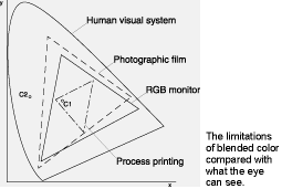
Beyond Blended ColorEven with all the colors you can build, some shades cannot be rendered mechanically. This limitation is called the gamut of the device. A monitor can show much of the color the eye can discern while full-color printing is limited to about half that much. On the other hand, inks can be manufactured to match hues unimaginable on screen such as neon or metallic shades; or even a true black. |
|
Illustrations were from http://www.visi.com/~drozone/handson/HTML/gifpallette.html for the Netscape palette and http://www.mediacentral.com/Magazines/DCMag/dcoct/f3.htm for the colorspace gamut. These sites are highly recommended for more details on the subjects.
© 1998 Bill Barnes.
Bill Barnes is a freelance small business system administrator. Bill@pc3.org
Index of articles | Index of Graphics articles
Top of Page | Home | Contact | Disclaimers
All material (c) Bill Barnes unless otherwise attributed
Last updated Sunday, September 05, 2004 01:49 PM